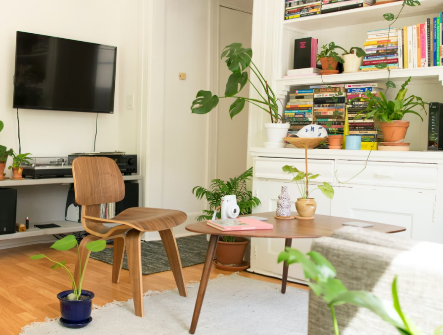
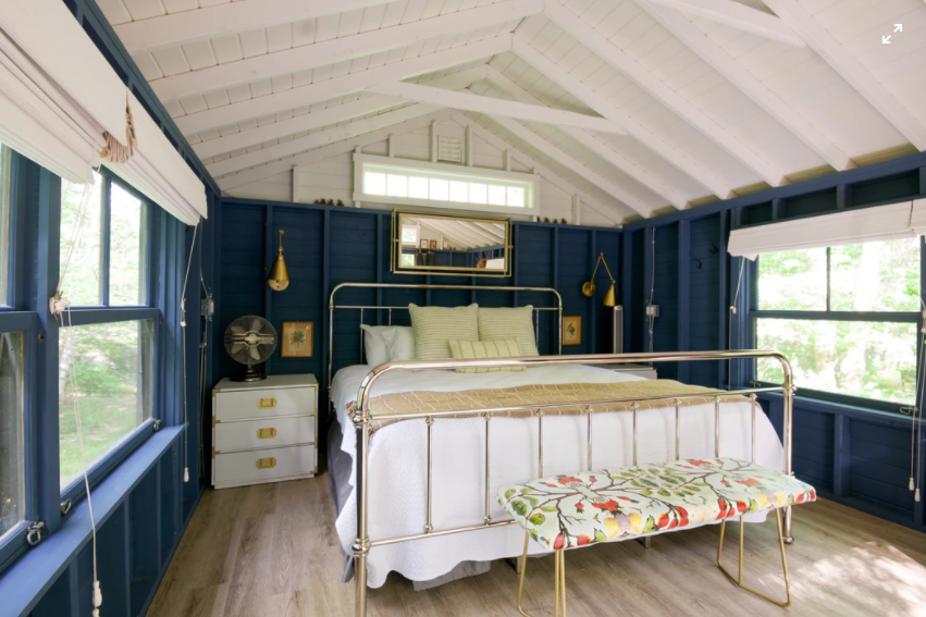
There has been a trend towards minimalism in interior design for a number of years!
Photos by: Stock Images
Less, it seemed, always had to be more. And so we've all been encouraged to spend most of our lives figuring out how to most effectively declutter our interiors, stripping down every living room, kitchen and bathroom to bare, functional bones. Perhaps inevitably, we are now seeing a reversal in the other direction. Instead of keeping everything simple and minimalist, some interiors benefit from throwing large amounts of color and visual interest into a room.
Interestingly, however, minimalism has not disappeared. This means that in 2022 we have two opposing schools of thought working side by side.
What are the differences between minimalism and maximalism?
It might seem obvious that minimalism means not using a lot of stuff, and maximalism means using a lot of it. In practice, however, the rules are somewhat more specific.
A minimal interior could be inspired by a very limited color palette. When it comes to contrast and texture, too, one may limit oneself to a certain theme – perhaps only materials from nature, with rounded edges and rough surfaces being preferred to right angles and shiny chrome. Or of course you could go with the opposite.

Minimalism is associated with mental well-being as the spaces it creates are designed to be easily processed. A few tactile elements can help add a bit of visual interest without being loud. For example, you might opt for knurling on your handles, or prefer coarse fabrics to fine ones.
Maximalism does not follow these rules – or actually rules of any kind. It's about making every color and finish as bright and personal as possible. This gives you the ability to bring in any items you really want, regardless of how they fit together or not.

Rise of minimal maximalism
You might think that these two philosophies are incompatible. But you can actually get them to work together. You can limit the maximum sections of a given space to just a few accented areas. So while your furniture and the lighting may be minimal, you may have a section of wall that makes a statement. Instead of layering maximum and minimum ideas on top of each other, place them in separate miniature sub-spaces within the same interior.
This compromise makes it easy to incorporate lots of loud, flashy elements without a result that becomes garish and overwhelming over time. This can actually be liberating as it gives you the confidence to make bold decisions without fear of going too far.


