Are you already making your design and decor plans for 2021? We also! Because of this, we are excited to see the great color palette trend predictions!
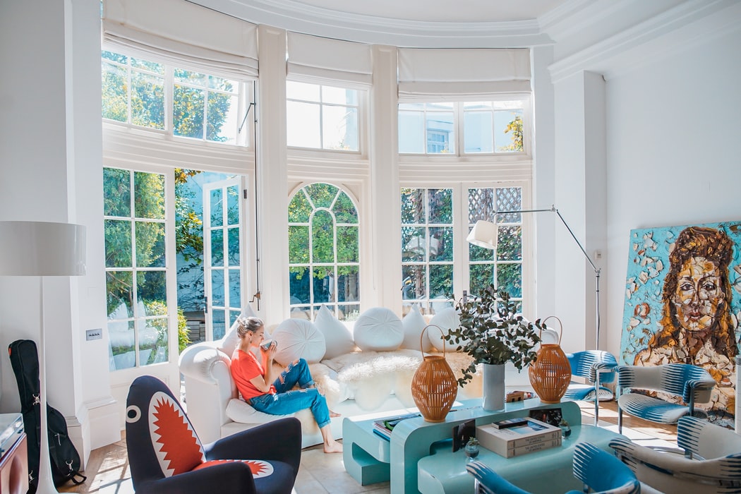 Photos by: Unsplash
Fortunately, there is something for everyone for 2021, whether you want to stay in your neutral comfort zone or are ready for more color. Overall, the 2021 color trends focus on shades that make you feel good, whether it's a fresh combination of pinks and greens, a mix of earthy hues, or a soft, approachable blue. If you're looking for a new color to update your home or if you need a color palette makeover, this article is sure to have the shade for you.
What is the Pantone color of the year 2021?
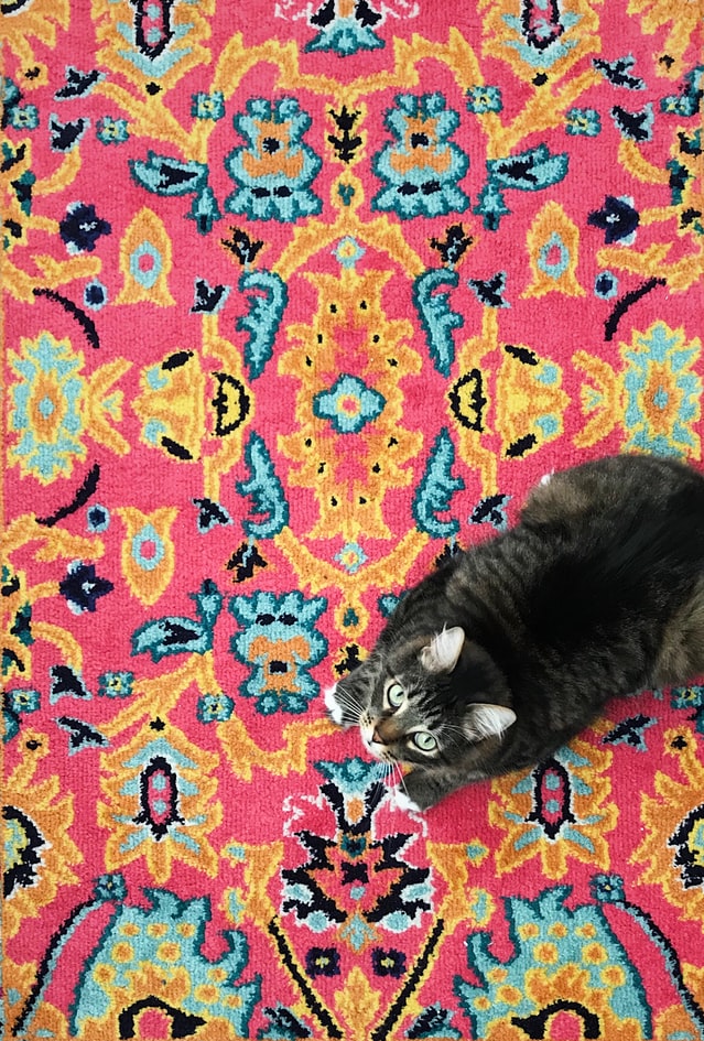
Pantone hasn't released its Color of the Year for 2021 yet, but they have released color trends for Spring and Summer 2021. The focus for the season is on bright, fun colors with unique contrasts. You won't find monochromatic neutral schemes in these three Pantone palette suggestions.
- Think flowery: “Summer Bouquet” mixes dreamy pinks and greens in a familiar palette that still seems so current.
- Pastel colors with a bang: “Intoxicating” combines a fresh mint green with a delicate pink and an unexpected yellow.
- Go bright or go home: “Power Surge” is all about strong colors and bright contrasts. We especially love the unique addition of “Pepper Stem” (PANTONE® 17-0542), a dusty green.
We also love Pantone's color predictions for New York Fashion Week for Spring and Summer 2021, which features lots of bright, upbeat hues and a stronger contrast between pinks and greens. For another trendy selection, check out the Pantone Color of the Year 2019: classic blue. Leatrice Eiseman, General Manager of the Pantone Color Institute, calls it a "solid and reliable shade of blue".
More trendy color schemes in 2021
Pantone may be a big name for color prediction, but many other design and decorating agencies are stepping in with their thoughts on color in 2021. Here are some ideas to consider for your home.
Colors for a calm, comfortable home
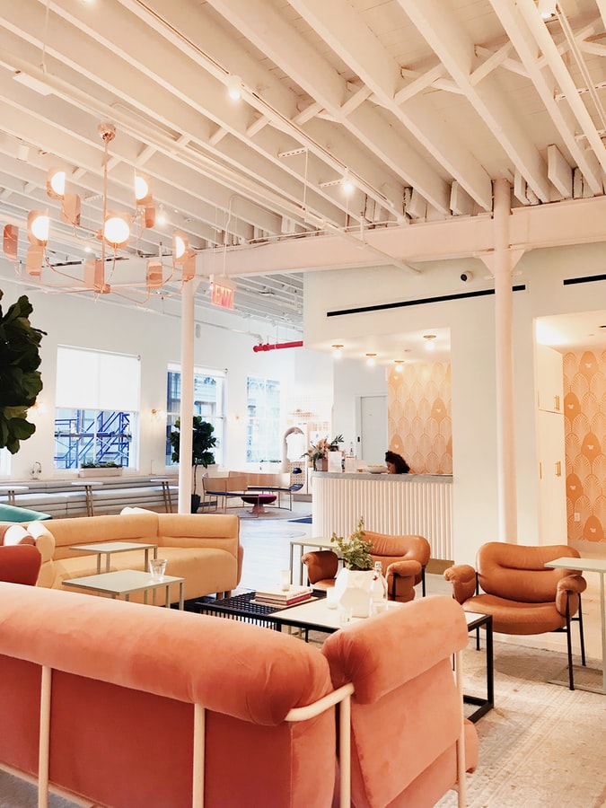
Color trends in 2021 continue to focus on creating homes that are haven for serenity in an ever-changing world. To use this color palette in your home, take a tip from Sherwin-Williams' 2021 “Sanctuary” color palette. Go for neutral colors with a warm hue and pair them with earthy colors like olive green and soft, tone-infused pinks. These colors are supposed to transform houses into oases and convey a feeling of calm. HGTV also predicts the popularity of earth tones in 2021, but that doesn't necessarily mean brown. Try to work in yellows and reds that lean towards organic.
Colors that inspire confidence
Other options for a calming home are blues, which have always been associated with a sense of reliability. Homes and Gardens named ocean hues as a critical trend for 2021, and some color and design authorities have also campaigned for blue to be their color of the year for 2021. For example, Benjamin Moore's 2021 color of the year is Aegean Teal, a muted, warm robin egg blue. The color scheme Benjamin Moore designed for this primary hue is calming and cozy, offering subdued but not bleak shades like "Gray Cashmere", "Amazon Soil" and "Rosy Peach".
Diamond Vogel released a 2021 color similar to Benjamin Moore's choice. "Dreaming of the Day" is a blue-green shade intended to promote relaxation and calm. If that wasn't enough evidence, trend forecasters WGSN also called the blue shade “A.I. Aqua ”, his color selection from 2021, reported here by Architectural Digest.
Optimistic shades for a new year
The New Year is traditionally a time to break old habits and start over with a new sense of optimism. 2021 is becoming a classic example of this, especially when it comes to color. Designers like Marie Flanagan and Allison Caccoma quoted in this Veranda article both predict bright, expressive colors and jewel tones for interiors in 2021. We see similar trends across the board, emphasizing bold yellows, turquoise, jeweled greens, magenta, oranges, and other bold hues that are balanced with warm neutrals and earthy blacks.
Sherwin Williams' Be Wild PPG palette and Tapestry color predictor bring these brighter colors to life. They have different approaches, but we love them both. The PPG palette contains high pops of color in shades such as "Cerise", a deep pink purple, and "Dynamo", a true, citric orange. Softer and slightly feminine, "Tapestry" mixes an emerald green "Cape Verde" with pink, blue and the buttery choice of "Enjoyable Yellow".
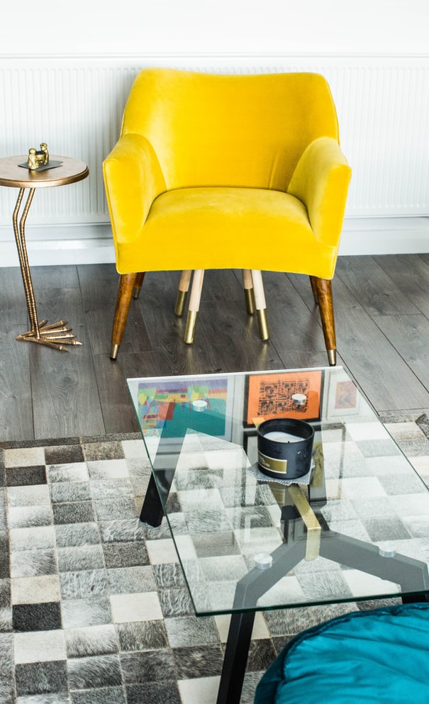
If saturated colors aren't your thing, go for the pastel version of the bright color trend. According to Wayfair Style Advisor Nadia McCowan Hill, pastels in this Cosmopolitan item will have their moment in 2021.
Focus on wellbeing
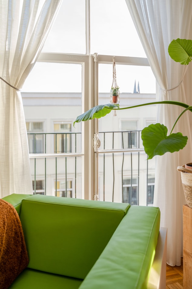
The colors that surround you in your home can dramatically affect how you feel. Two thousand and twenty-one color trends focus on individual wellbeing. We are particularly seeing continued interest in greens. The trendy green tones range from olive to sage and mint to blue tones. Whether combined with a contrasting color or more neutral shades, green is a fantastic color to fit into your home.
Some greens we love are the deep and capricious “Royal Orchard” hue in Behr's 2021 color palette trend forecast “Quiet Haven” and the wise hues in PPG's “Be Well” palette. In a versatile mix of colors, green is also a recurring theme in Pantone's trend reports. We also love that green can act as a background shade for other colors. Lilu Interiors even calls it "natural" because of its versatility and connection to nature. If you are hoping to make your home a relaxing place to relax, a touch of green can be the answer.
Is Gray still in 2021?
Gray has been a trending color for years, but some color palette predictions and experts like Ruth Mottershead, Creative Director of Little Greene, quoted in Ideal Home, suggest there will be a decline in 2021. The general trend seems to be towards warmer or lighter tones instead of cooler, more sterile tones.
Instead of gray, try softer, brown or cream-colored neutrals in your home. The limitation of this trend is that you should always choose colors that lift you up and make you happy. If gray gives you a sense of calm and well being in your own home, definitely keep using it.
Take away designer
The right color can enhance any room and make a bedroom a calming haven, a kitchen a warm heart of the house, or an office a quiet haven of creativity. Be inspired by these diverse color schemes and plan your home for 2021. For more information on colors in 2021, see the Nova of California blog post: “Just the beginning: color trends for 2021. “In addition to the trendy color inspection, NoC's lighting experts give advice on how to make the most of light and fixtures for each color, e.g. B. to change the color depth or to emphasize the undertones of a color.


